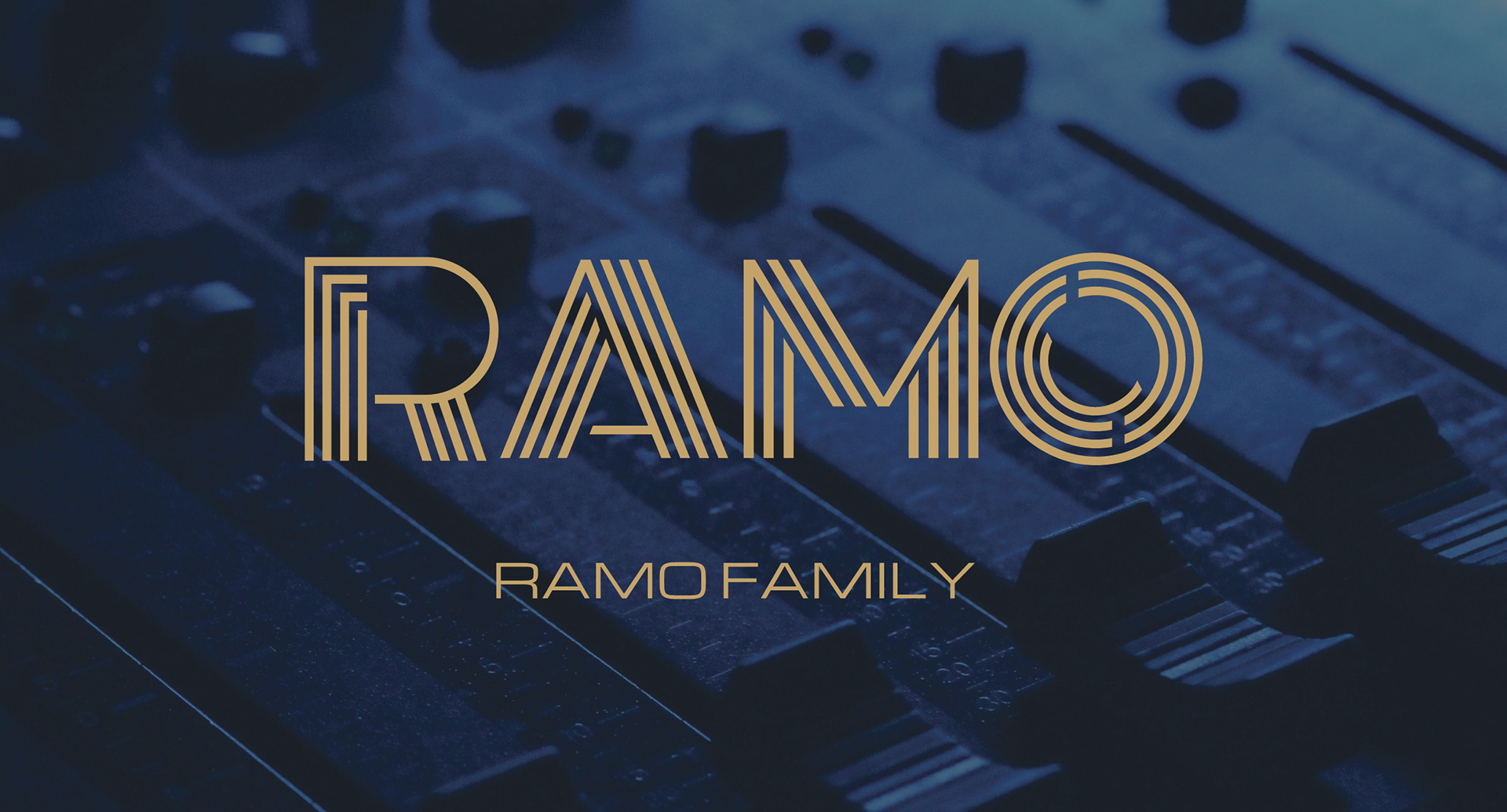
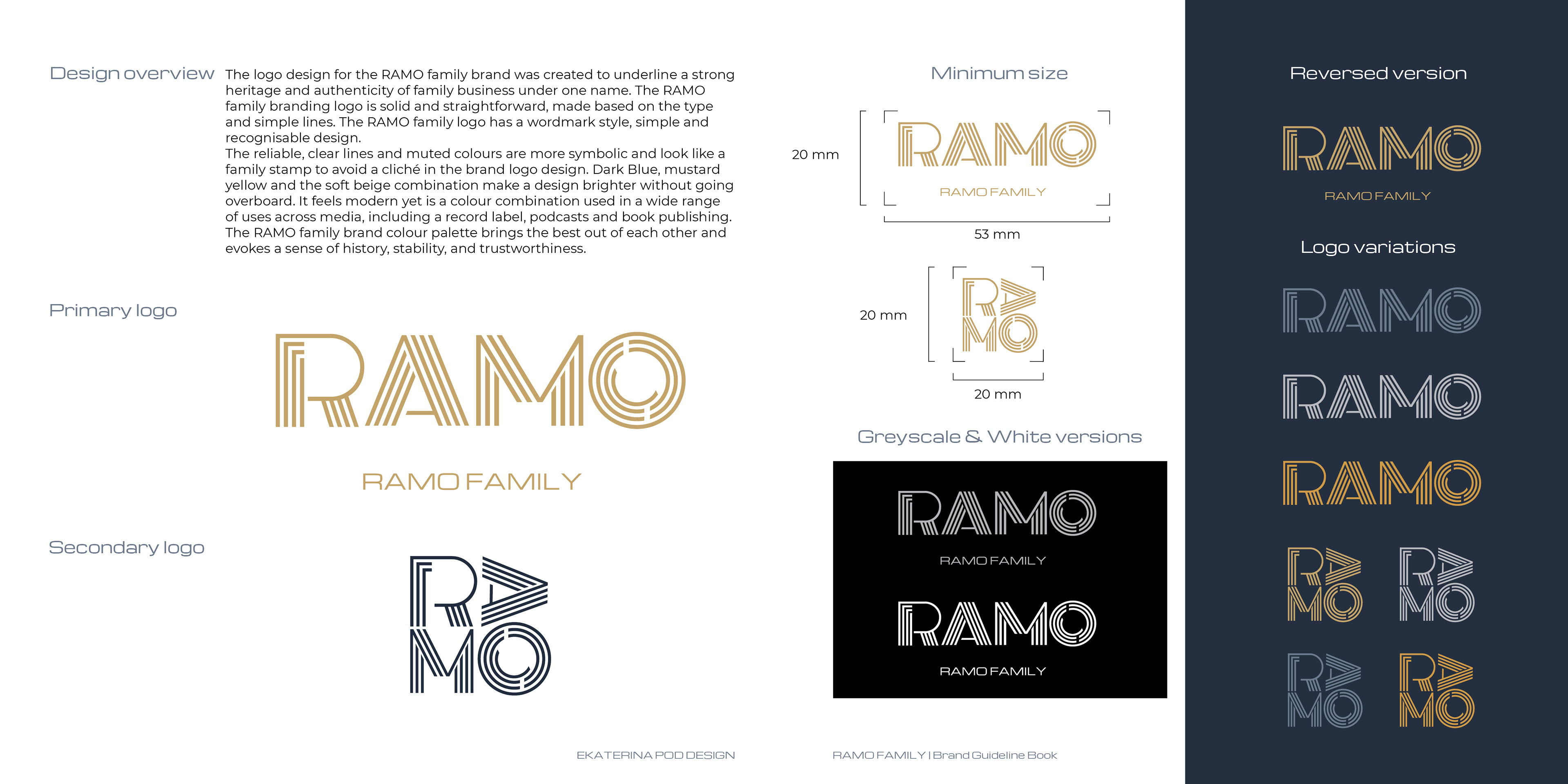
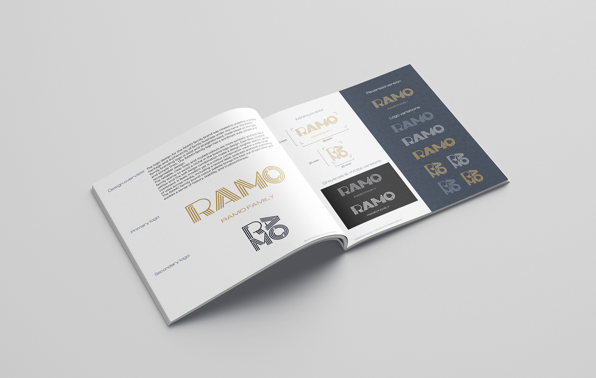
I created the logo design for the RAMO family brand to underline the strong heritage and authenticity of the family business under one name. I was inspired by Aboriginal face painting and constructivism for the logo design concept. The RAMO family branding logo is solid and straightforward, based on the type and simple lines. The logo has a wordmark style and a simple and recognisable design.
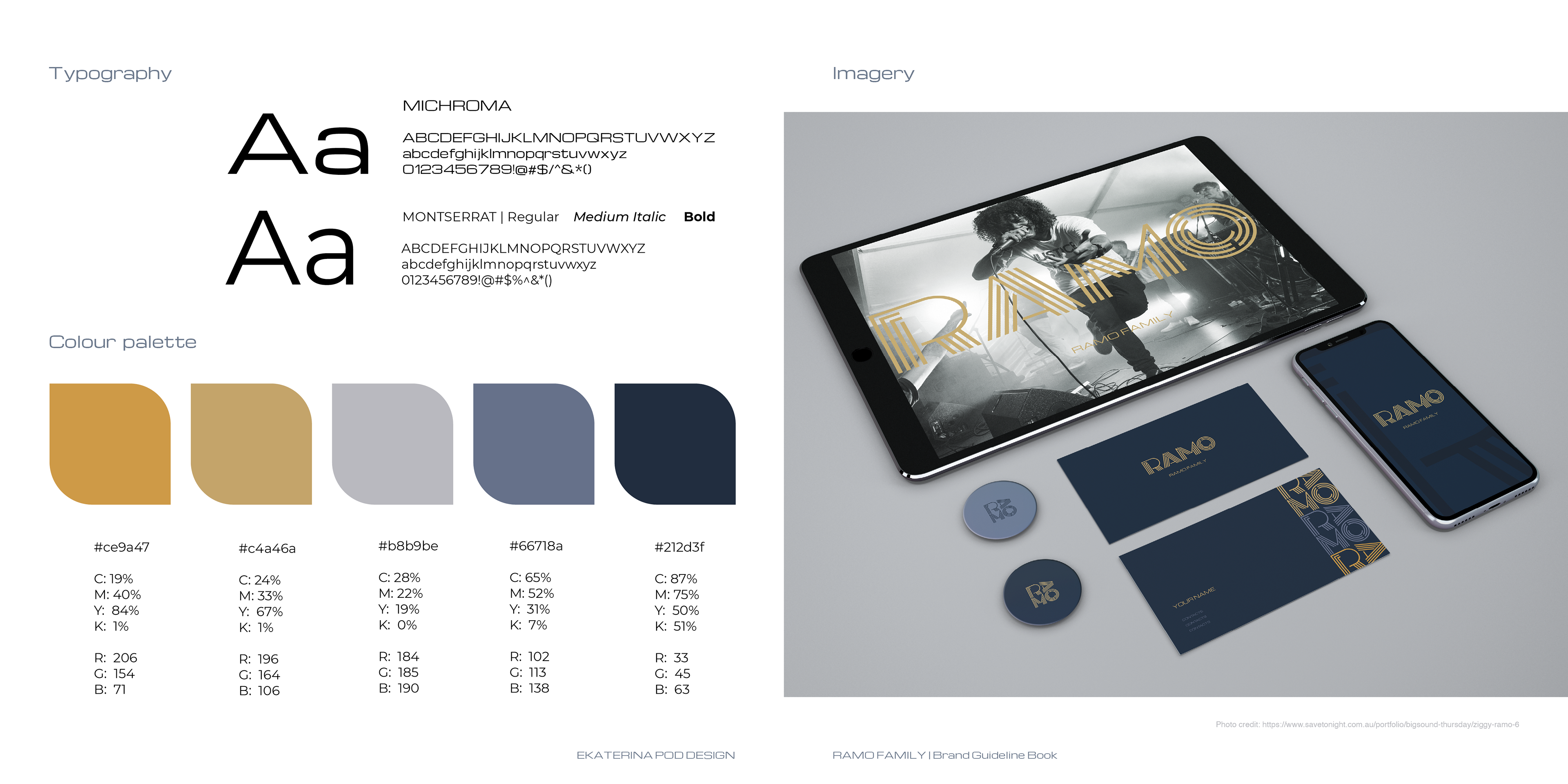
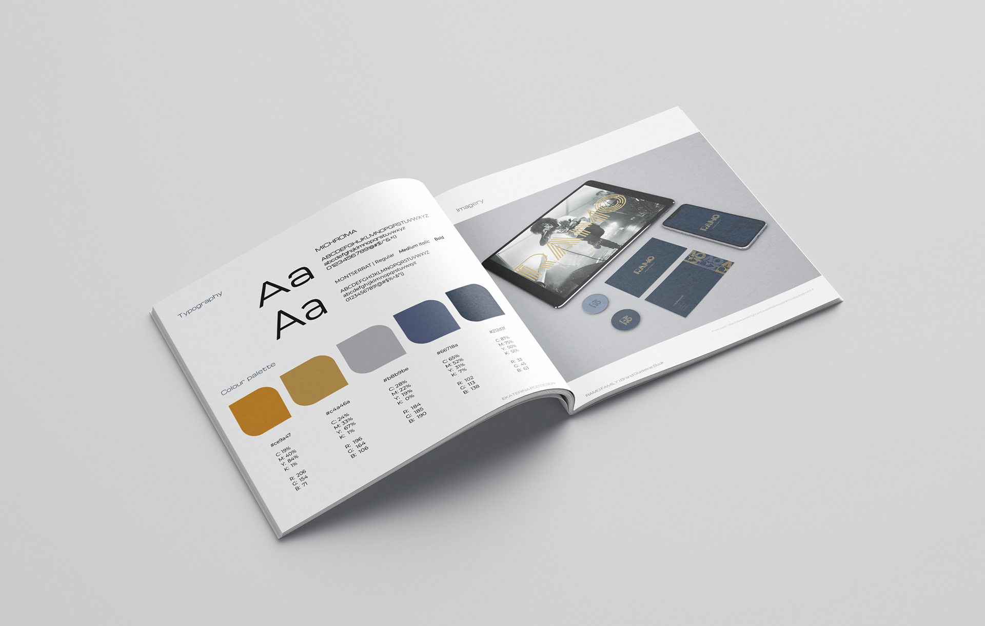
For the colours, I went with muted colour palette according to what the client likes. The reliable, clear lines and muted colours are more symbolic and look like a family stamp to avoid a cliché in the brand logo design. Dark Blue, mustard yellow and the soft beige combination make a design brighter without going overboard. This image could efficiently work in several different palettes as well. It feels modern yet is a colour combination used in various uses across media, including a record label, podcasts and book publishing. The RAMO family brand colour palette brings the best out of each other and evokes a sense of history, stability, and trustworthiness.
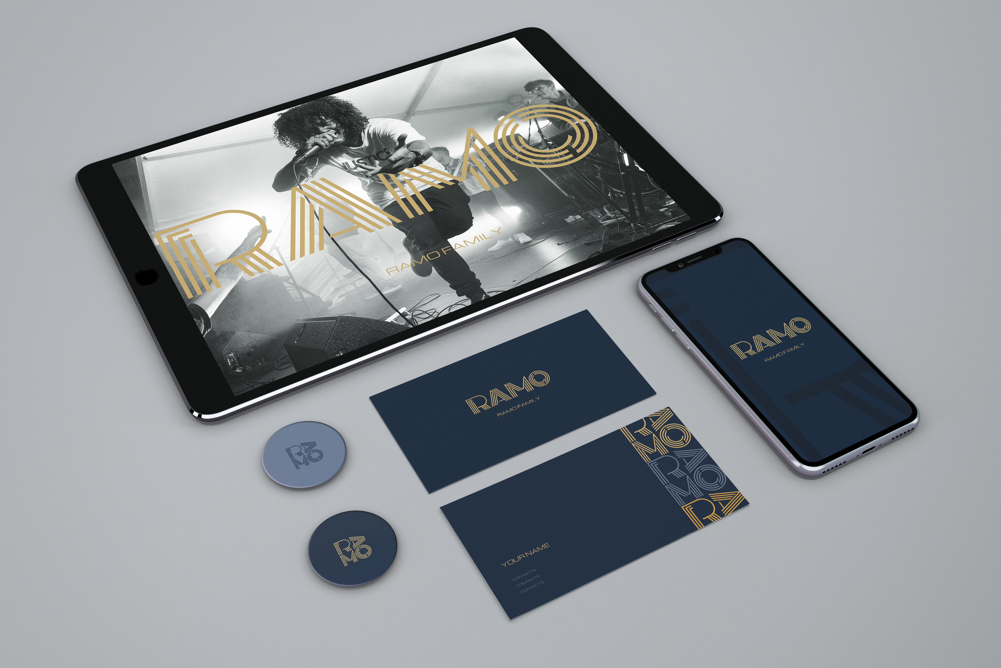
Photo: www.savetonight.com.au/portfolio/bigsound-thursday/ziggy-ramo-6; Unsplash; mockups-design.com/