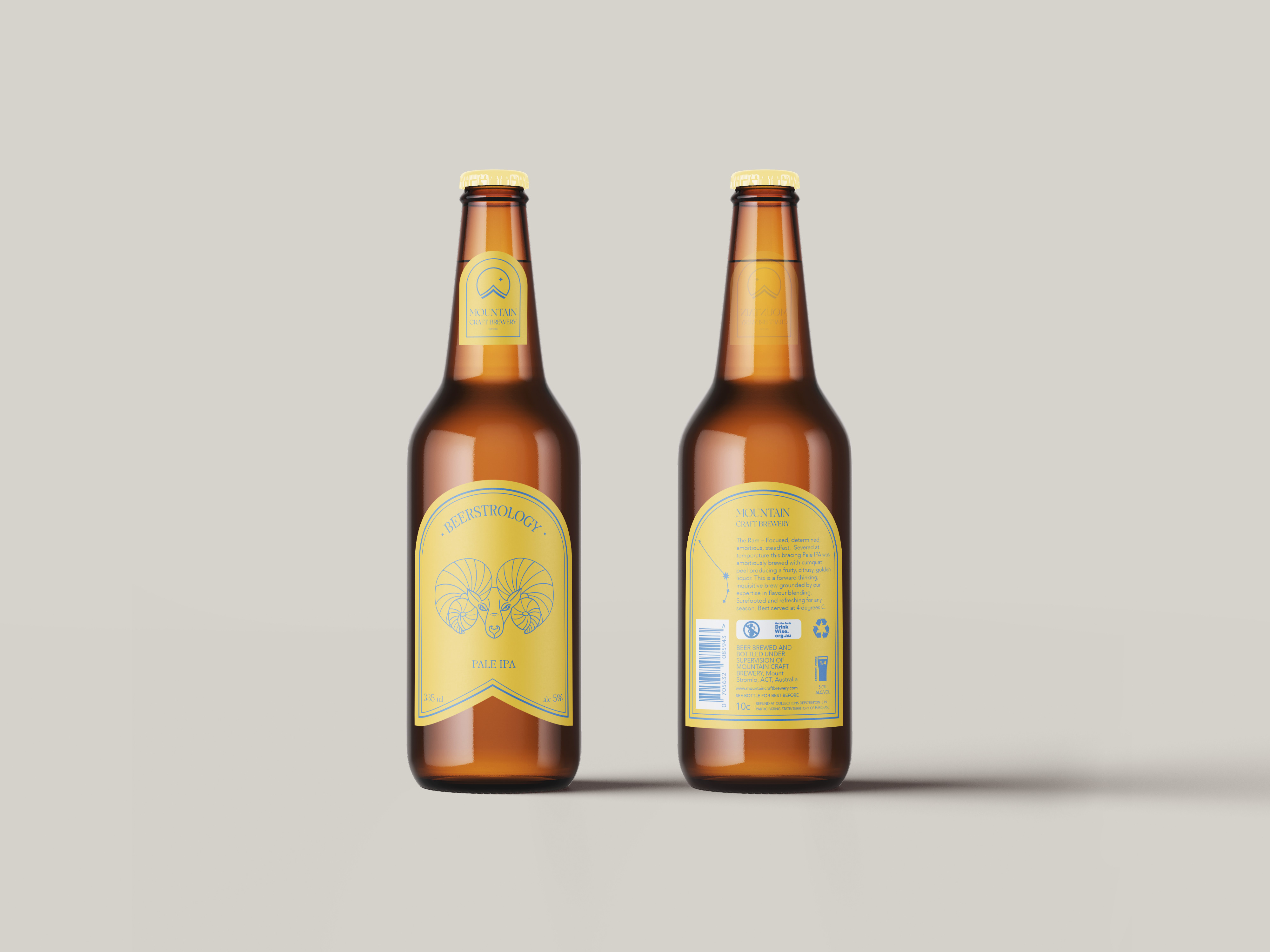
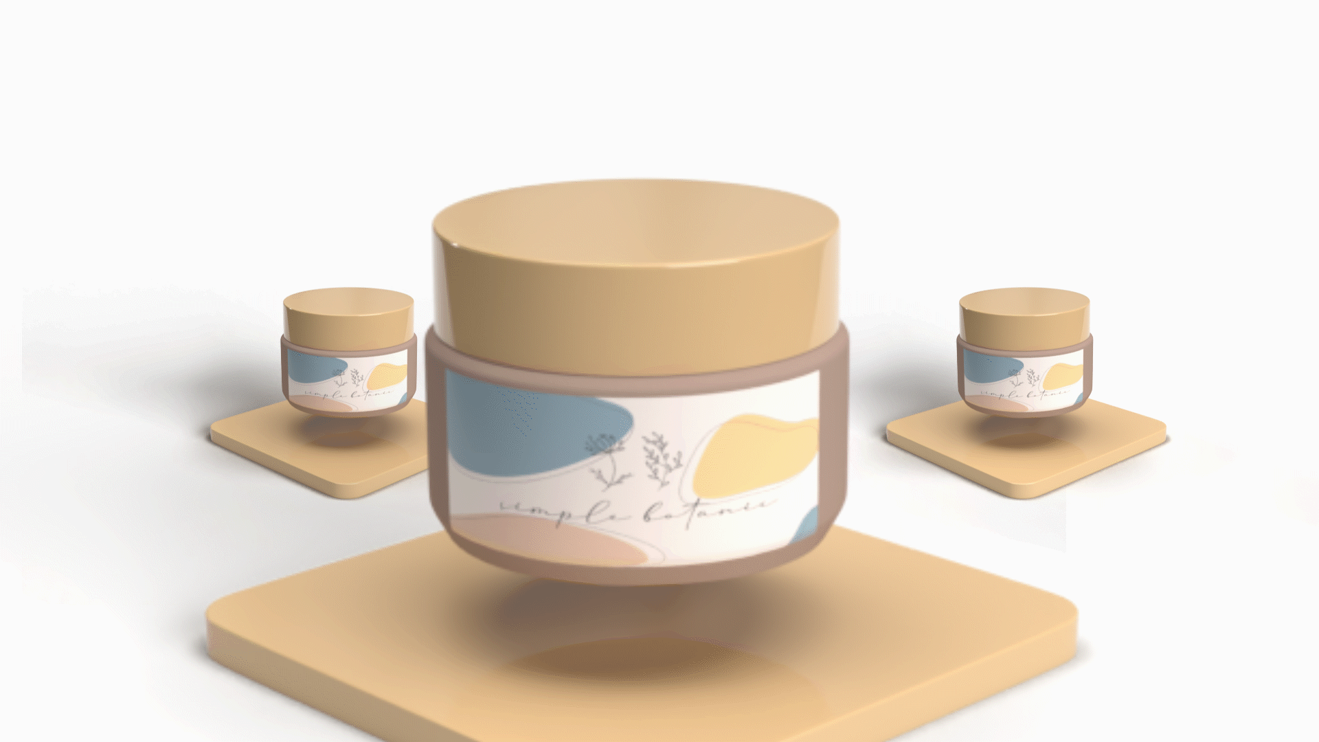
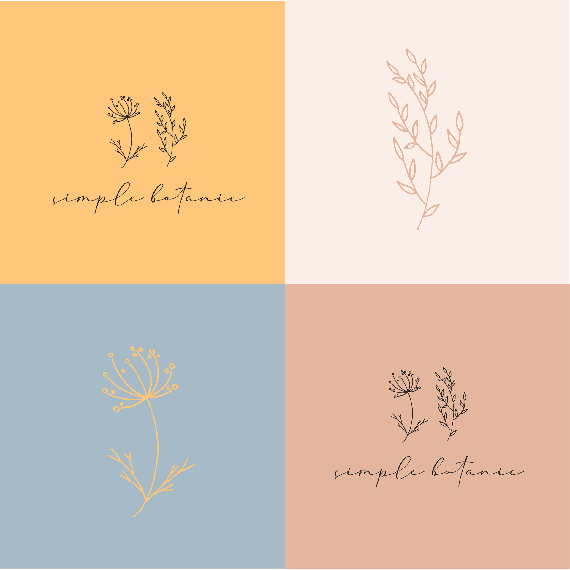
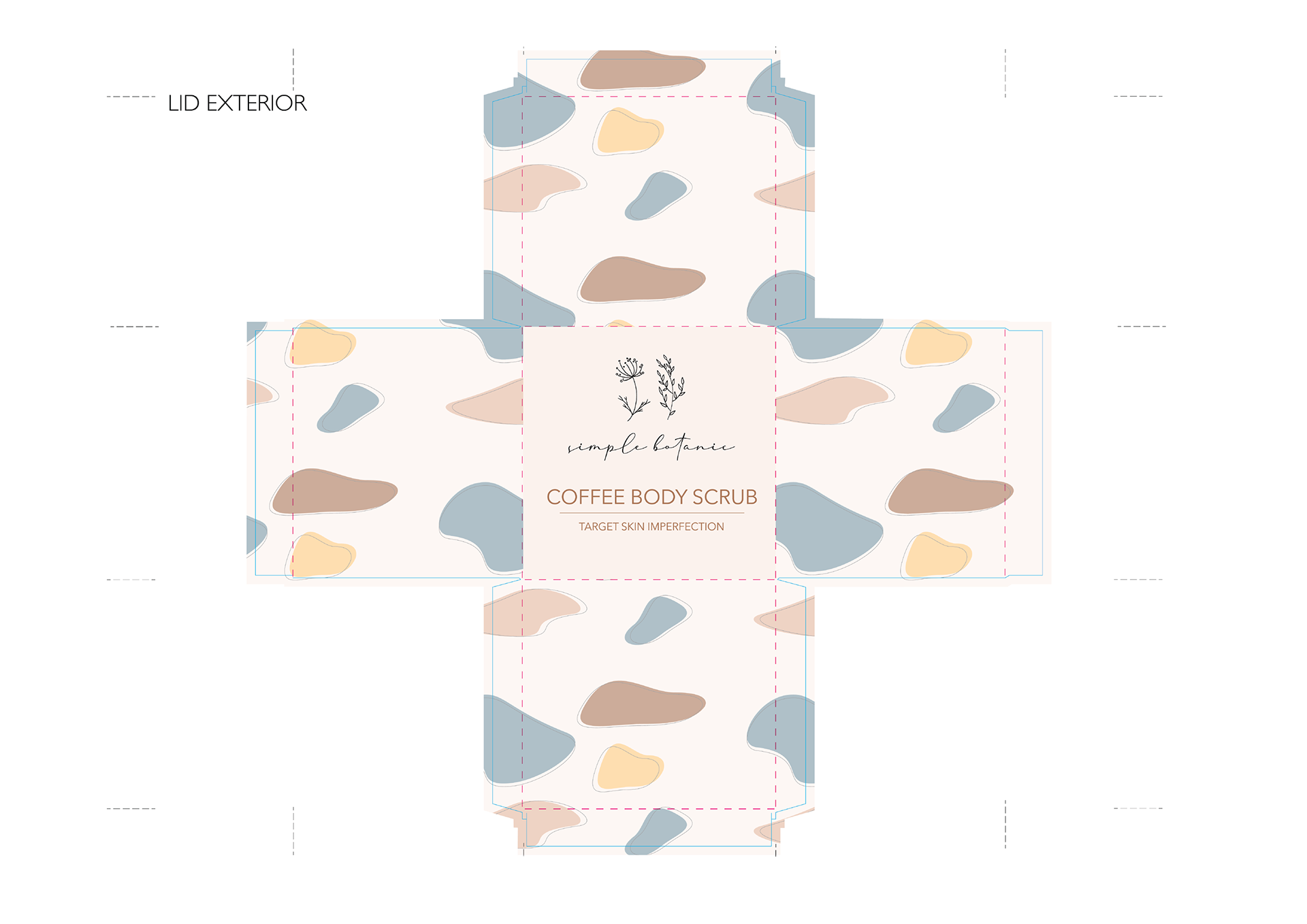
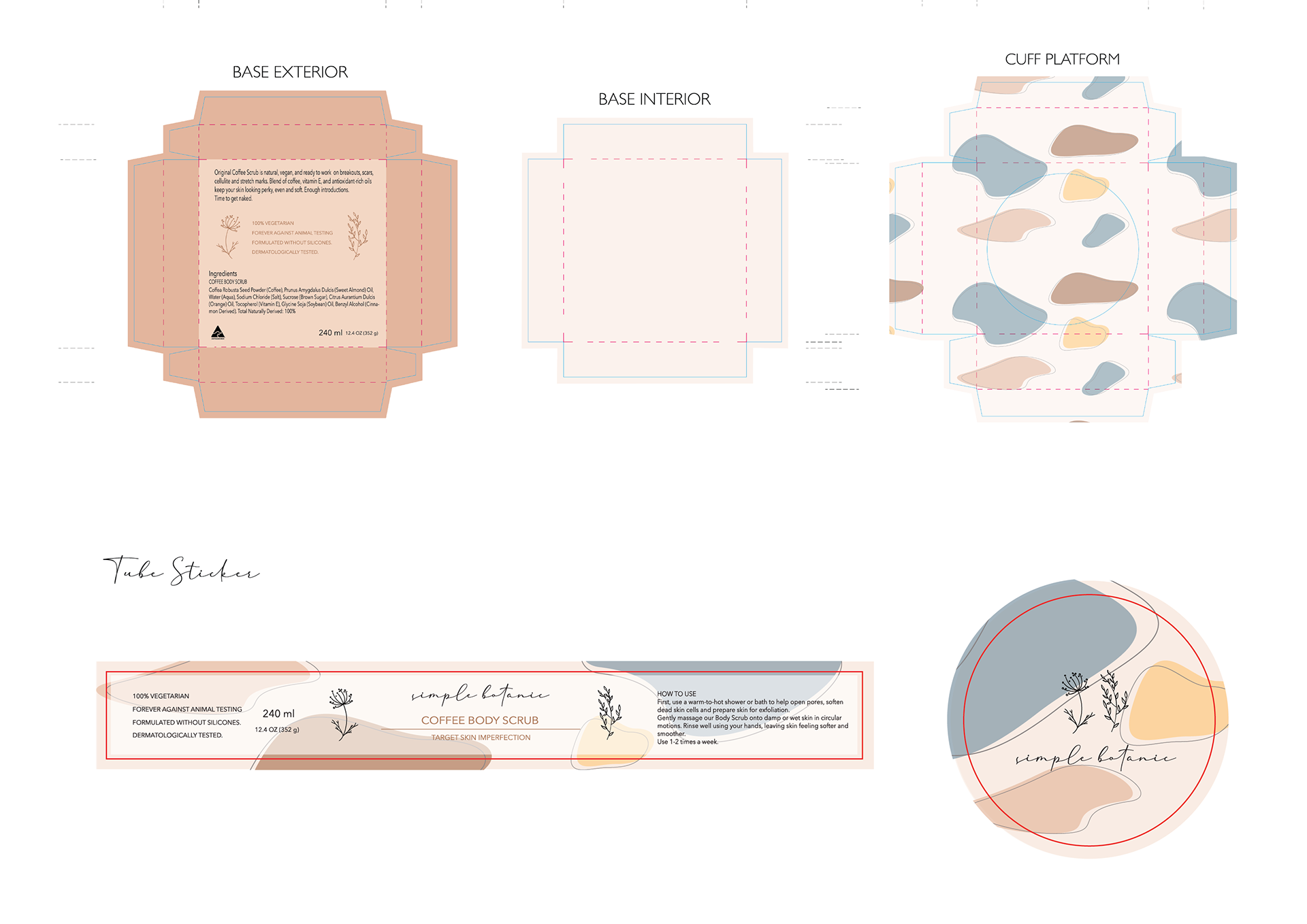
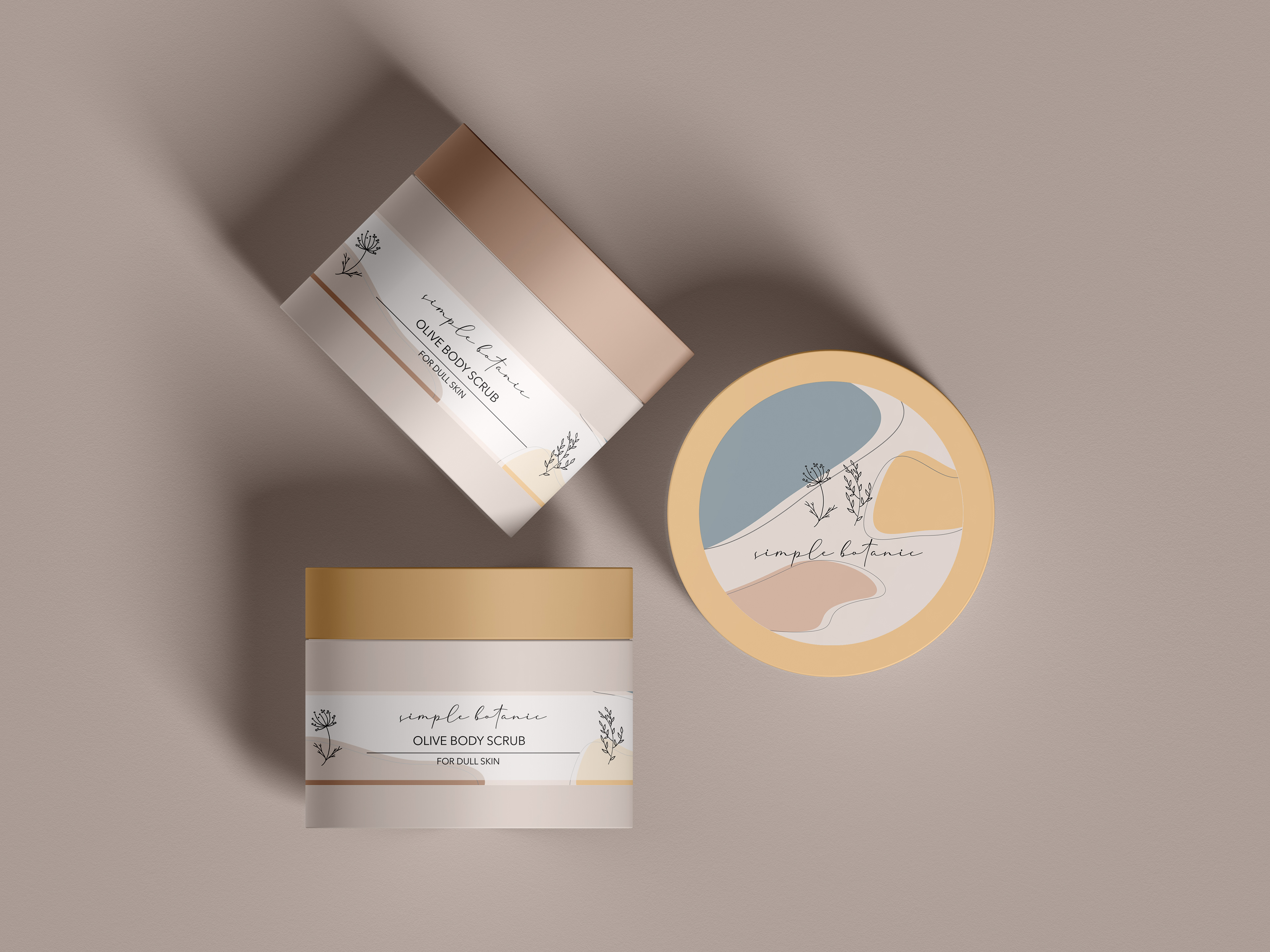
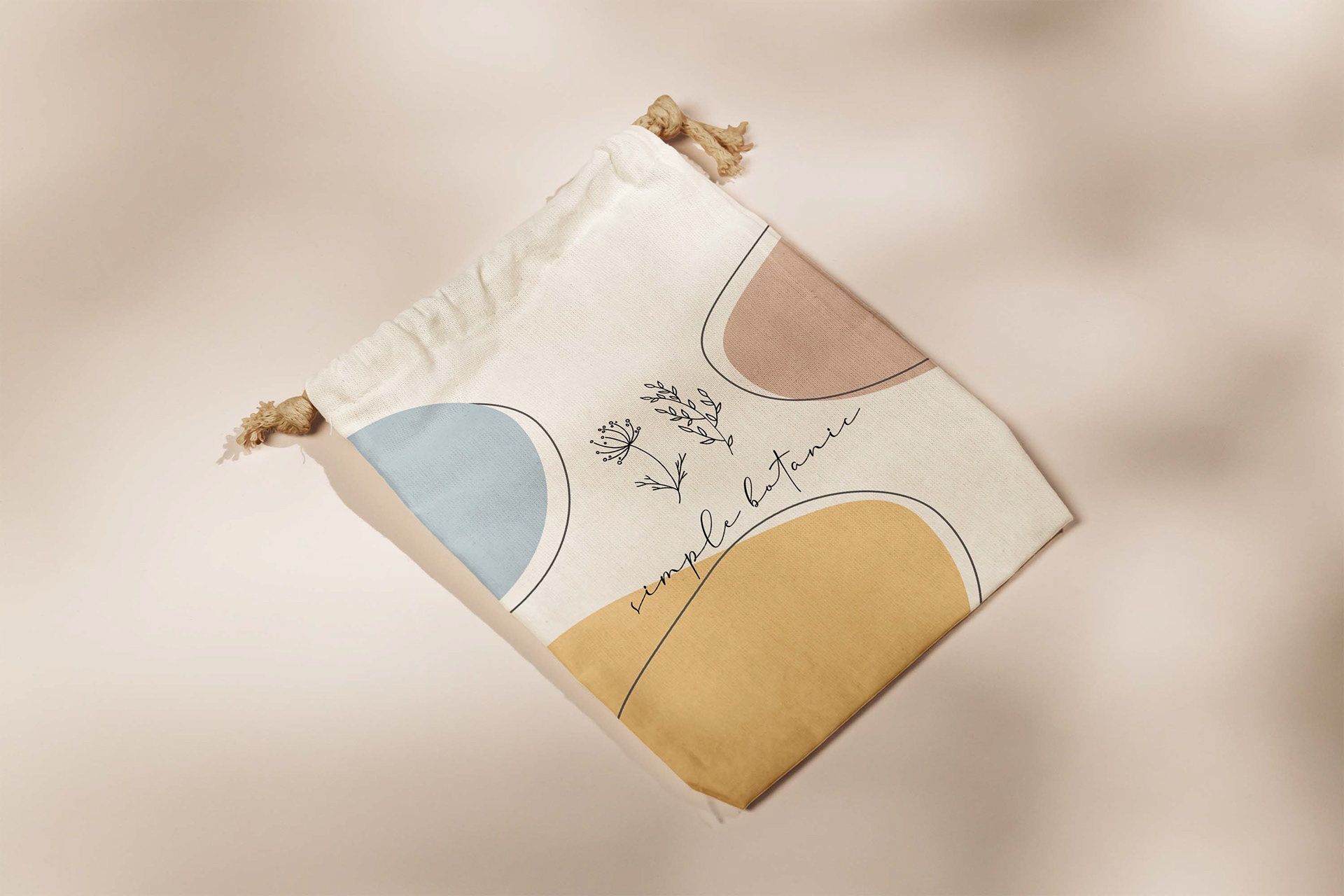
`Simple botanic, your simple way to be perfect` slogan of the company. I made a logo, design for the box, UI pages and stickers for this project. For packaging design, I choose botanical elements and a neutral colour scheme. Simplicity is a general idea of this design. Two linear-style flowers and stone patterns symbolise a nearness to nature. This idea showed in a final mock-up and reflected on the whole project.
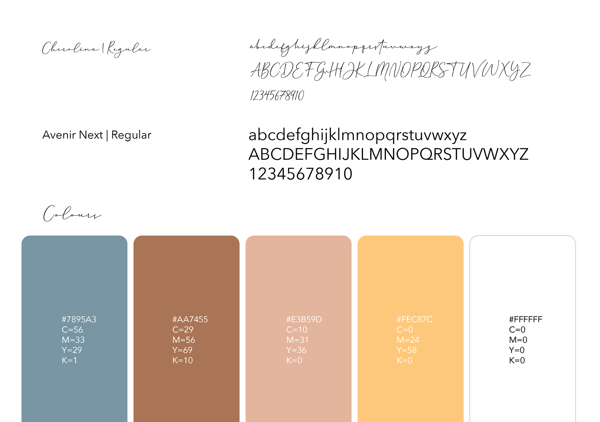
The elements and principles of design are the parts that define the visual composition of my 3D packaging creative work. The lines direct the eye towards a particular area of design work. I implemented it in leaves and flowers as well as on stones patterns. Colour and texture are the most significant elements of my design because they can suggest pure emotions. Neutral colour tones represent calm, purity and elegance. I wanted to express the femininity of my design product and used curvy shapes such as ovals and circles.
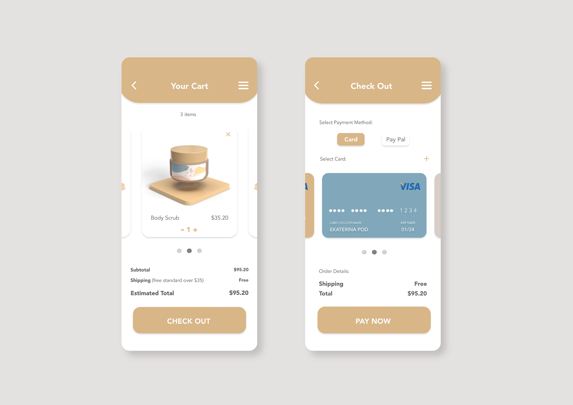
I think white space is a great tool to balance design elements and better systematise content to improve the visual communication experience.
The elements and principles of design are the parts that define the visual composition of my 3D packaging creative work. The lines direct the eye towards a particular area of design work. I implemented it in leaves and flowers as well as on stones patterns. Colour and texture are the most significant elements of my design because they can suggest pure emotions. Neutral colour tones represent calm, purity and elegance. I wanted to express the femininity of my design product and used curvy shapes such as ovals and circles.
I think white space is a great tool to balance design elements and better systematise content to improve the visual communication experience.
Photo by Maddi Bazzocco on Unsplash; Mockup rawpixel.com; Music Bensound